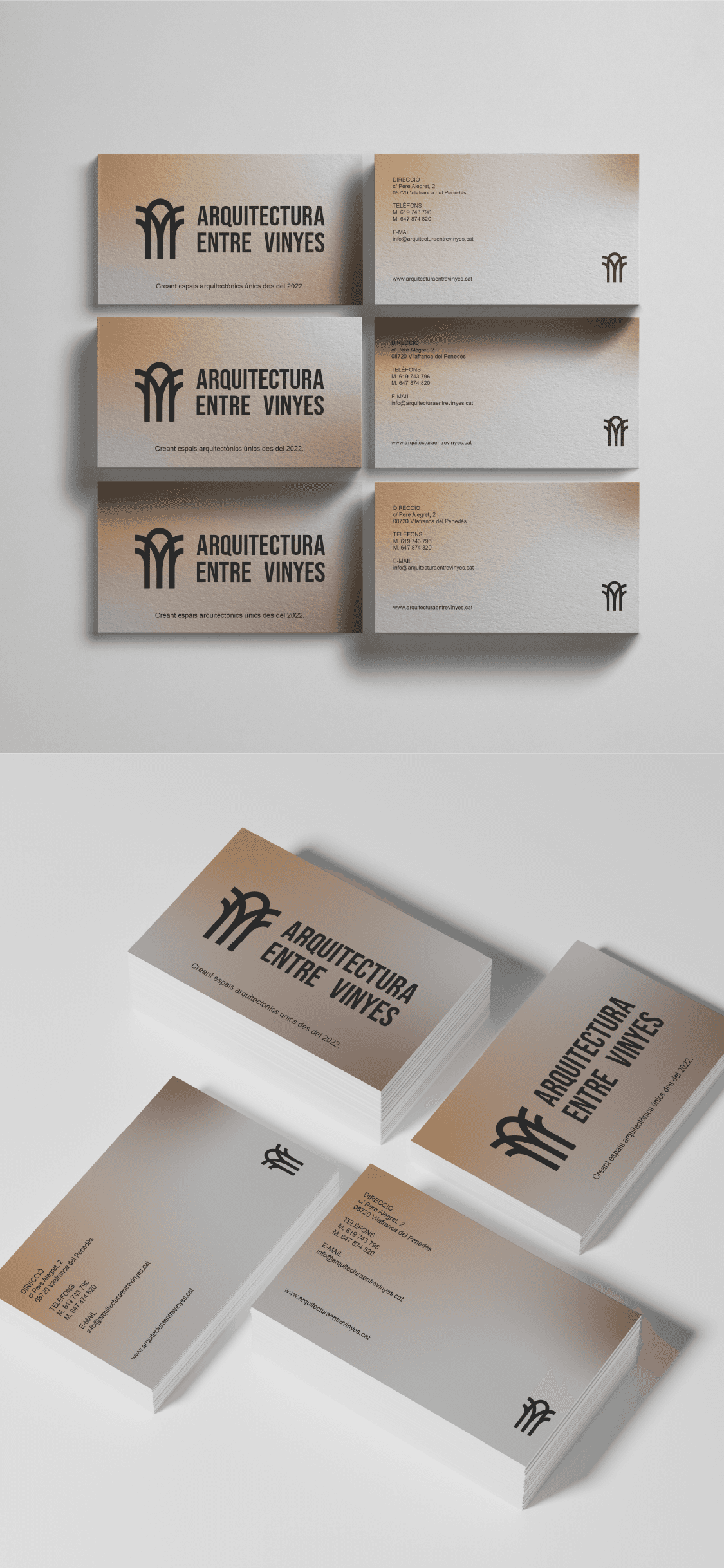
Arquitectura entre vinyes

Arquitectura
entre vinyes

Client

Arquitectura entre vinyes

Arquitectura

entre vinyes

Year

2024

Category

Branding

Duration

1 month

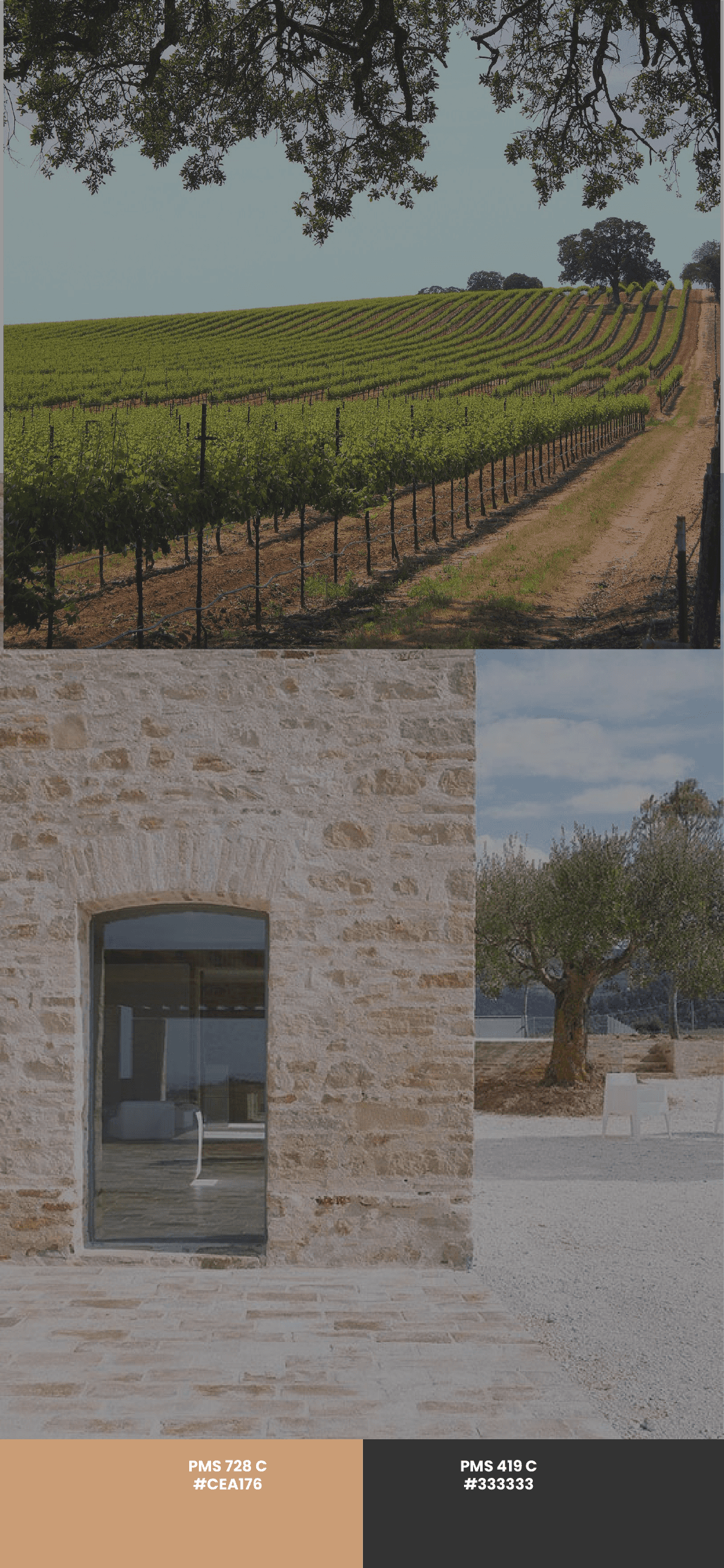
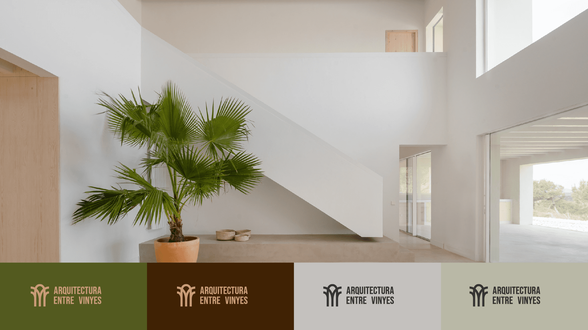
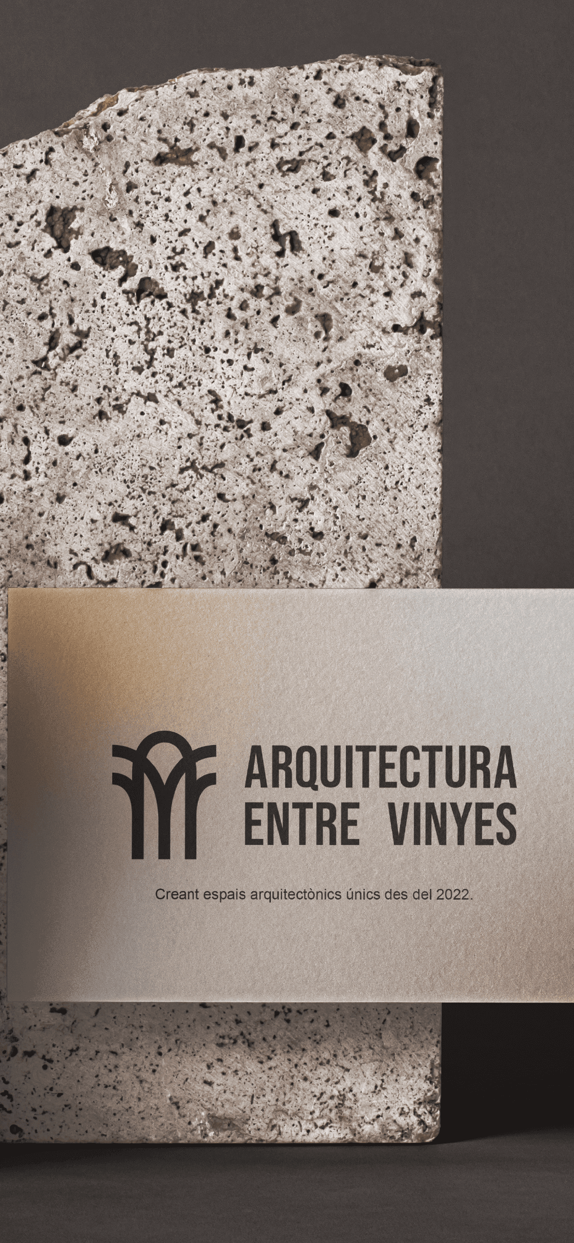
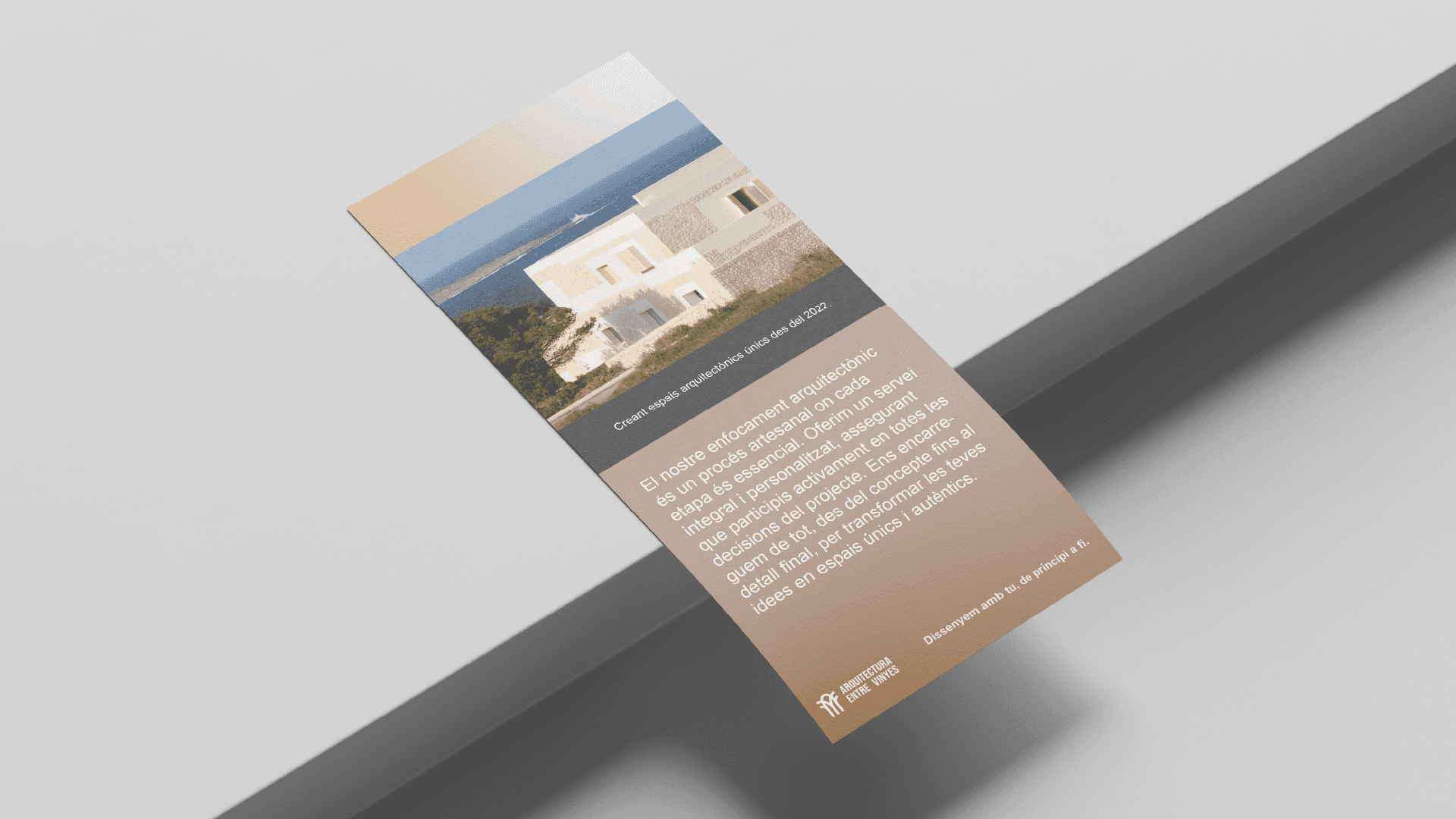
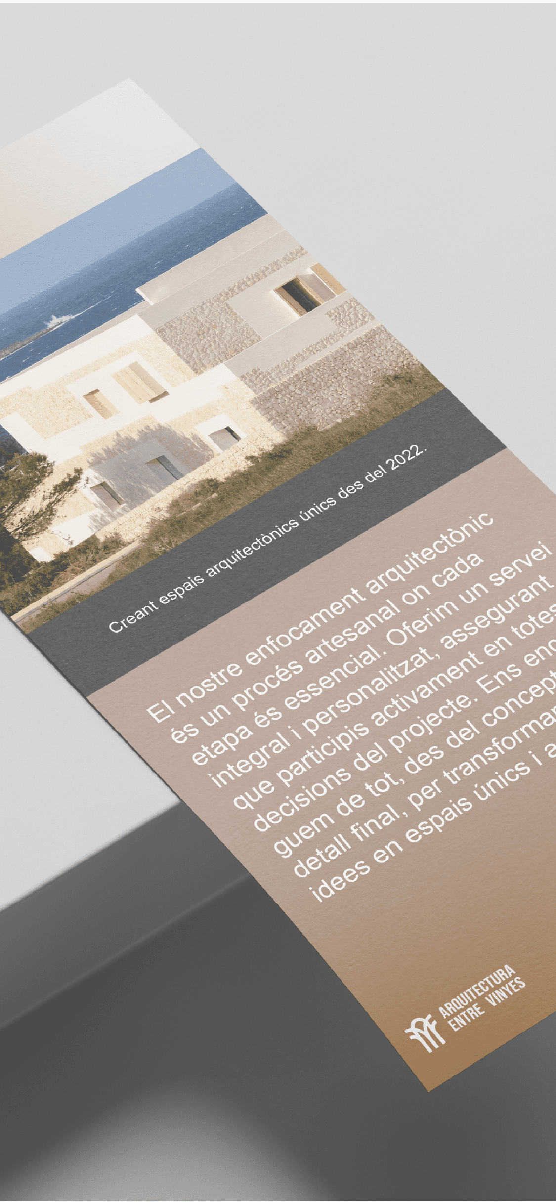
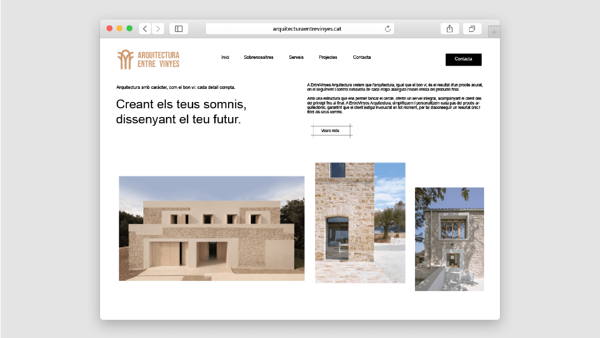
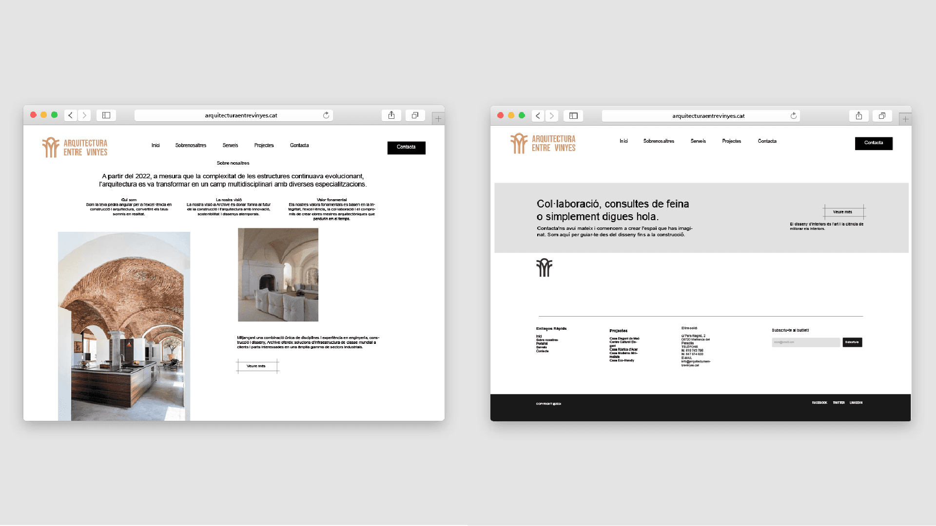
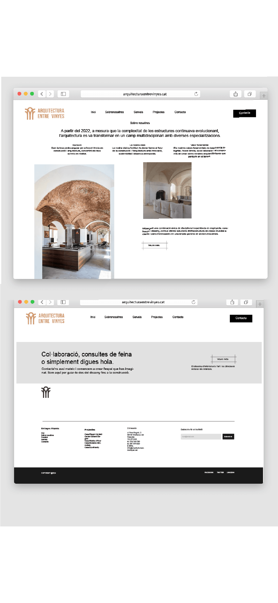
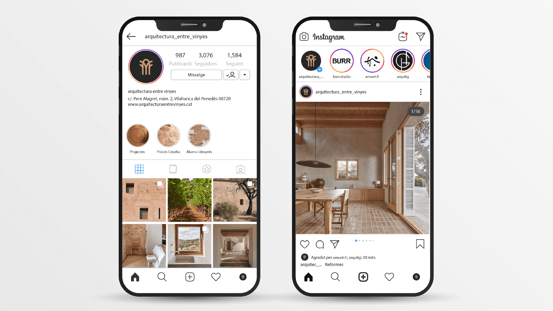
EntreVinyes Arquitectura, founded in 2022 in Vilafranca del Penedès, specializes in the design, construction, and maintenance of exclusive and innovative architectural spaces. Its focus on quality is based on a careful selection of materials and rigorous supervision of each project, aiming to exceed the aesthetic and functional expectations of its clients, offering a personalized experience.

Logo Description

Logo
Description

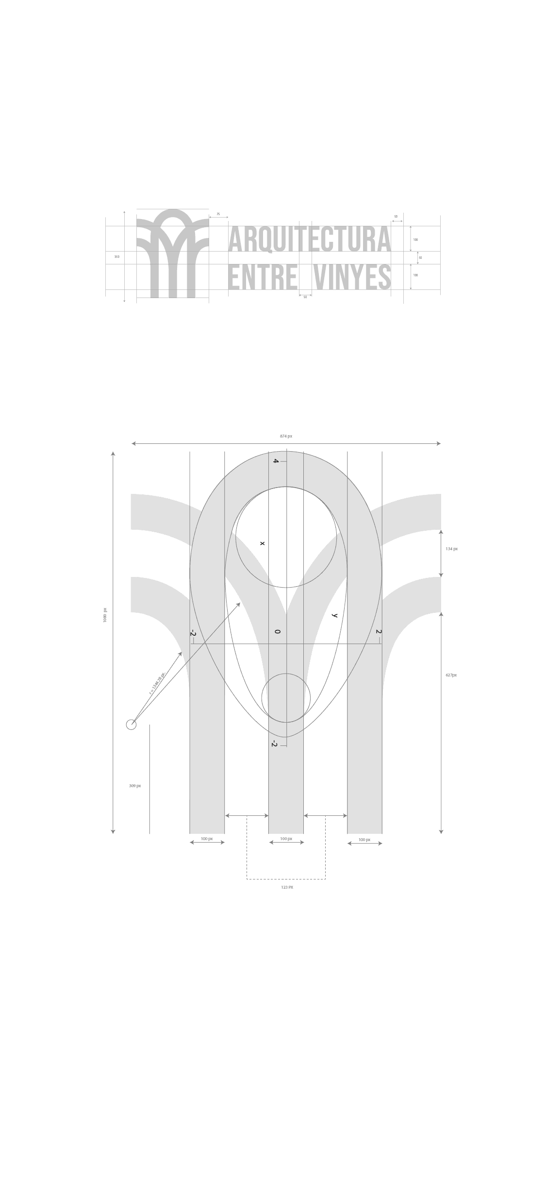
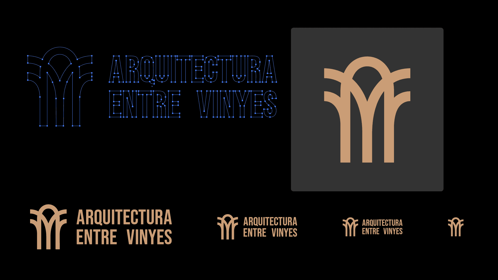
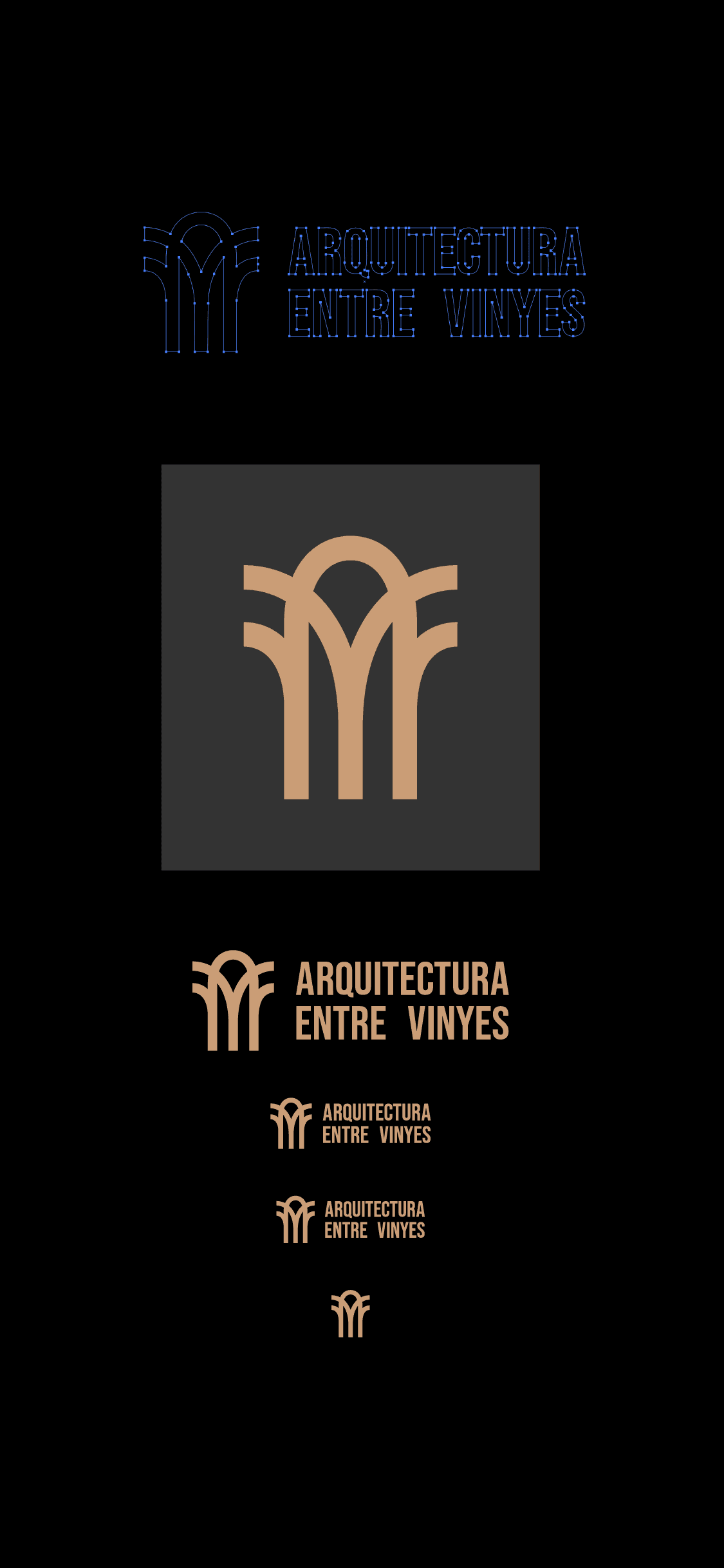
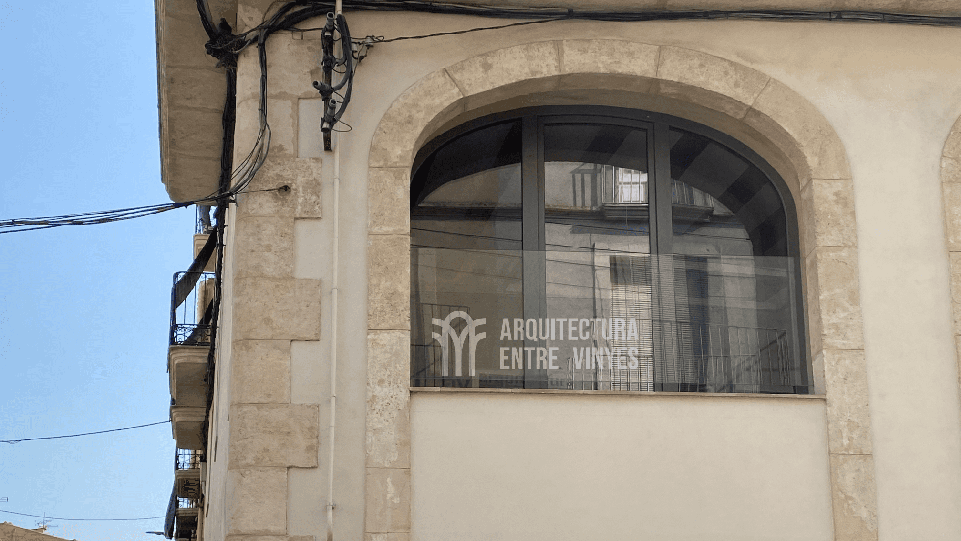
Initial Inspiration: The logo design is inspired by the combination of classical architectural shapes with natural elements. The original idea stems from the Catalan vaults, known for their curves and semicircular structures. These organic shapes are present in the semi-ovals located on both sides of the logo, symbolizing both elegance and structural solidity.

Elements

Center: In the center of the logo is a vine figure, with branches extending on both sides, representing growth, expansion, and connection with nature. This choice is not casual; the vine symbolizes life, continuity, and fertility, values that reflect the philosophy of the architecture studio.

Meaning of the Branches: The branches of the vine, which spread towards the ends of the logo, represent the fusion between tradition and innovation in architecture. On one hand, they evoke deep roots in architectural history and culture; on the other, they suggest growth toward the future and adaptation to new trends and needs of the environment.

Circles and Shapes: The use of circles in the design evokes the curves of Catalan vaults, while symbolizing perfection, integrity, and the studio's centered focus on each project. Additionally, the circles suggest a holistic vision, in which all elements of the design integrate in a harmonious and balanced manner.

The logo focuses on a figure of a vine, symbolizing life, continuity, and fertility, reflecting the philosophy of the architecture studio. The branches represent the fusion of tradition and innovation, connecting architectural roots with future growth. The circles in the design evoke Catalan vaults, symbolizing perfection and integrity, and suggest a holistic and balanced view of design.

Corporate Color:

PMS 728 C (#CEA176)

This warm tone, which combines shades of beige and light brown, reflects a connection with nature and conveys elegance and warmth in architectural projects. The PMS 728 C color is ideal for projecting reliability, professionalism, and attention to detail. Its visual softness also suggests a welcoming and accessible approach, key qualities in client interaction.

When this color is used in the logo, especially in combination with curved shapes inspired by Catalan vaults and the clamp in the center, a perfect balance between tradition and modernity is achieved. The blend of traditional architectural elements with a contemporary approach to design highlights both heritage and innovation.

PMS 728 C color, a warm tone between beige and light brown, reflects a connection with nature and conveys elegance and warmth in architecture. It projects reliability, professionalism, and accessibility. When combined in the logo with curved shapes and the central clamp, it balances tradition and modernity, highlighting heritage and innovation in architectural design.

Complementary Color:

PMS 419 C (#333333)

To complement the warm tone of the corporate color PMS 728 C (#CEA176), the color PMS 419 C (#333333), a very dark gray, almost black, has been selected. This color conveys solidity, elegance, and an air of professionalism, providing a strong and sophisticated foundation for the visual identity of the studio. It is perfect for the secondary elements of the logo, such as lines, outlines, or typography, offering a subtle contrast that highlights the modernity and contemporary character of the design.

The use of PMS 419 C balances the warmth of the primary color with a sense of seriousness and confidence, creating an image that evokes both stability and innovation. This color scheme ensures that the brand conveys professionalism and an timeless sophistication.

The PMS 419 C (#333333) color, a very dark gray, almost black, complements the warm PMS 728 C (#CEA176), providing solidity, elegance, and professionalism. Ideal for secondary elements like lines and typography, this color balances the warmth of the primary with seriousness and confidence, highlighting the modernity of the design. Together, they create a visual identity that reflects both stability and innovation, conveying a timeless sophistication.

EZE CREATIVO

Eze creativo

EZE CREATIVO

©2024 eze creativo

BACK TO TOP

©2024 eze creativo

BACK TO TOP

©2024 eze creativo

BACK TO TOP

©2024 eze creativo

BACK TO TOP